Word Cloud
Word clouds are used to visualize text data, displaying member elements from the given hierarchy; the size of each word is driven by the value, while the color is driven by whichever hierarchy is added to the Color zone. Word clouds are traditionally used to visualize the frequency of use of tags, or words in a text, but can be used for a variety of other purposes as well.
Build a Word Cloud Chart
To build a word cloud, add 1 blue chip to the Categories zone, and 1 blue chip to Color (this may or may not be the same chip added to Categories, depending on which hierarchy should be used to drive the color), and add 1 measure to Values.
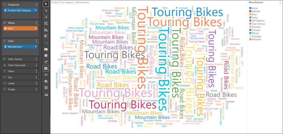
In the image below, the chart shows Sales of Product Subcategory by Manufacturer: the text represents the product subcategories, the color represents the manufacturer, and the text size represents the sales.
Examples
Open the Sample Demo model in Discover to follow the examples below.
Example 1
Step 1
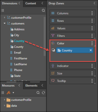
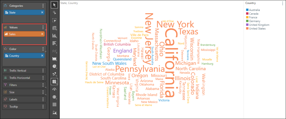
From the Customers dimension, add the Country hierarchy to the Color zone.
Step 2
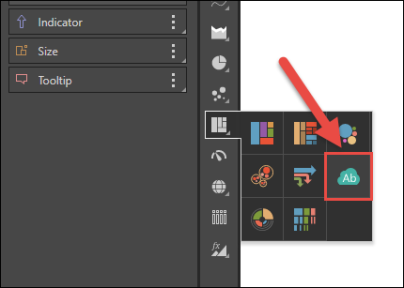
Select Word Cloud Chart from the visualization menu.
Step 3
Add the State hierarchy to the Categories zone.

Step 4
Add the Sales measure to the Values zone; you will now see a word cloud displaying sales by state, color-coded by country.
Example 2
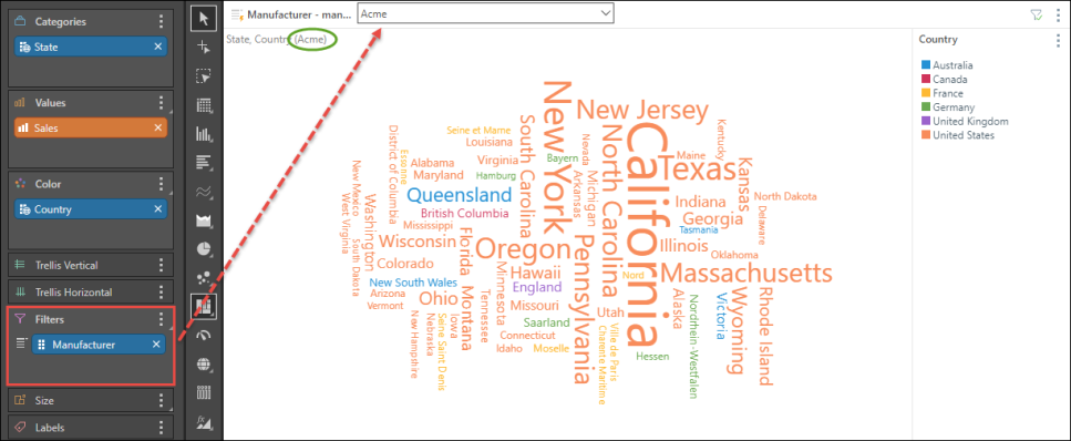
This example follows on from Example 1 (above), with more advanced functionality used to further define the query.
Step 1
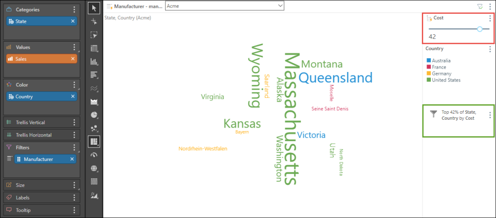
From the Manufacturers dimension, add the Manufacturer hierarchy to the Filters zone, to enabling filtering by manufacturer from the slicer.
Step 2
Add the Cost measure to the Filters zone to create a data filter; dragging the Cost measure over the Filters zone, drag it to Data Filters in the sub-menu, then drop it in Top Percent from the next sub-menu.
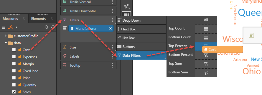
From the Cost slider produced (red highlight), filter the query by the top n percent of costs (green highlight).